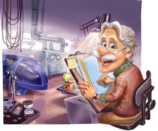
I really like all of the colorful variety in the picture, and I love it that we get to see into Whit's workroom/the basement! Some people said Whit looks too childish. I disagree. He looks like he's doing what he loves: inventing. And he looks happy to see us. Sure, it's probably directed more toward younger kids, as usual, but I definitely think it's an improvement over Album 55's cover.
What are your thoughts?
P.S. Thanks very much to all of you who commented letting me know you were reading yesterday. As I said, I was feeling pretty down-in-the-dumps, so it was some much-needed encouragement.

While it's nice to see Whit inventing. .they've changed his style too much. .and it doesn't fit. I have enough trouble with André as Whit, and this doesn't help either :p
ReplyDeleteI love this cover. I'm sure you've already noticed, but you can see Whit's Boredom Buster and the Imagination Station in the background.
ReplyDeleteYeah, I'm glad that Whit is the only one on the cover for once. ;D
ReplyDeleteI did notice those. But did you notice the very top of the old Imagination Station just visible in the back? It's the "phone booth" one that was used in the old videos. :)
Wow! To be honest, I didnt expect to get the cover and the description this early! I just wish they would release some more episode titles!
ReplyDelete